揭秘:宜家“迷宫”的玄机
|
爱思英语编者按:您是不是曾经在宜家商场里迷了路呢?没关系,很多人都有这样的经历。一位从事商场设计的专家说,宜家内部的布局,是这个家具销售连锁企业心理武器,让消费者不再想着自己口袋里有多少钱。
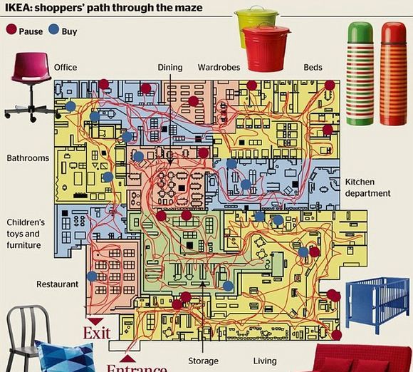
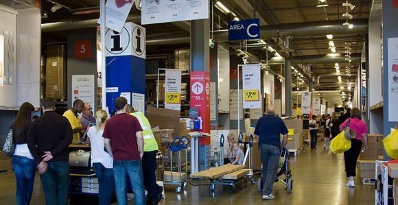
Why shoppers find it so hard to escape from Ikea: Flatpack furniture stores are 'designed just like a maze' If you've ever found yourself hopelessly lost in an Ikea store, you were probably not alone. The home furnishing chain's mazy layouts are a psychological weapon to part shoppers from their cash, an expert in store design claims. The theory is that while following a zig-zag trail between displays of minimalist Swedish furniture, a disorientated Ikea customer feels compelled to pick up a few extra impulse purchases. According to Alan Penn, director of the Virtual Reality Centre for the Built Environment at University College London, Ikea's strategy is similar to that of out-of-town retail parks - keep customers inside for as long as they can. 'In Ikea's case, you have to follow a set path past what is effectively their catalogue in physical form, with furniture placed in different settings which is meant to show you how adaptable it is,' he said. 'By the time you get to the warehouse where you can actually buy the stool or whatever's caught your eye, you're so impressed by how cheap it is that you end up getting it.'http://www.engbus.cn英语巴士网 While its stores have short-cuts to meet fire regulations, shoppers find the exits hard to spot as they are navigating their way through displays of flat-pack furniture, he added.http://www.engbus.cn英语巴士网 'Also you're directed through their marketplace area where a staggering amount of purchases are impulse buys, things like lightbulbs or a cheap casserole that you weren't planning on getting. 'Here the trick is that because the lay-out is so confusing you know you won't be able to go back and get it later, so you pop it in your trolley as you go past.http://www.engbus.cn英语巴士网
'It's not like somewhere like John Lewis where everything has a logical lay-out and you know you'll probably be able to navigate your way back to the same spot again.' Alongside its reputation for good, cheap design, Ikea's distinctive labyrinth has been phenomenally successful with 283 stores in 26 countries and profits of £2.3 billion last year.http://www.engbus.cn英语巴士网
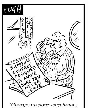
The sometimes gruelling strategy - dubbed 'more like S&M than M&S' by Prof Penn - is similar to that employed by out-of-town shopping centres to attract customers then keep them in side for hours on end, he added.http://www.engbus.cn英语巴士网 Studies at the Bluewater centre in Kent found that shoppers spent an average of just over three hours inside, with a significant number spending eight hours at a time there.http://www.engbus.cn英语巴士网 Malls are subtly designed to keep shoppers moving around the retail floor, rather than towards the exit, while the frequent need to drive to the middle of nowhere means visitors are encouraged to make a day of it.
Along with familiar cafes and play areas, a common design is the 'dog bone' mall, where a large store at either end - such as Marks & Spencer or Debenhams - is attracted at knock-down rent, while smaller stores like Next or Mothercare cluster in-between to take advantage of the custom they generate.http://www.engbus.cn英语巴士网 Supermarkets use similar tactics, according to Prof Penn. 'They couldn't get away with having shoppers going in one single route like Ikea, so what they do is put popular purchases like milk and bread at the far end of the store so you have to walk past shelves of other products on the way.' |


